Plotting thematic maps with tmap
Recommended R packages for plotting :
- tmap: special-purpose package for thematic maps in R. [static, focus here]
- mapview: quick, single-function to interactively view spatial data(frames). [interactive, demonstrated]
- ggplot: most popular package for datavis in R, recent and growing support for maps. [static, not discussed here]
- leaflet: flexible, general purpose package for interactive maps. [interactive, not discussed here]
The tmap-package is recommended for the likely use cases for static maps historians will encounter, get from reviewers, etc. Relatively easy to get a quick thematic map, as demonstrated by qtm(), but also extremely large range of options to to build and tweak final map.
Learn more / questions on maps:
- Books: “An Introduction to R for Spatial Analysis and Mapping (2018)”, “Geocomputation with R (full-text)”, “Data Visualization. A practical introduction”, "Fundamentals of Data Visualization (full-text).
- Questions on Stackoverflow.
- Datacamp courses.
tmap In an nutshell:
- Quick ’n dirty thematic maps: Quick thematic map:
qtm() - Build map in layers with lots and lots of control and options:
tm_shape(),tm_fill(),tm_borders(),tm_lines(),tm_layout()etc. - Cherry-on-top: switch between interactive and static plotting with
tmap_mode('view')andtmap_mode('plot').
Some resources on tmap:
- Documentation tmap: press F1 with cursor on a tmap-function in Rstudio, and look online.
- Getting started with tmap
- https://geocompr.robinlovelace.net/adv-map.html
- Background and walkthrough: Tennekes, M., 2018, tmap: Thematic Maps in R, Journal of Statistical Software, 84(6), 1-39.
library(here)
library(mapview)
library(sf)
library(tmap)
library(dplyr)
library(readxl)
library(scales) # for function percent_format()
# (1) load spatial data
raillines <- st_read(here('data/source/census_1851_raillines/1851EngWalesScotRail_Lines.shp'))
districts_spatial <- st_read(here('data/source/census_1851_districts/1851EngWalesRegistrationDistrict.shp')) %>%
mutate(CEN1 = as.numeric(as.character(CEN1))) # make sure identifiers are the same type
# (2) load and add data-of-interest
districts_data <- read_excel(here('data/census1851_districts_count.xlsx'))
districts <- left_join(districts_spatial, districts_data, by = c('CEN1' = 'district_id'))Layered building of thematic maps
qtm() is quick and perfect to get the first view, or an initial map to share. But if you need to go futher with tweaking, styling, or more complex maps, building a thematic maps works well with the “layered” approach of tmap for building a thematic map.
Below an non-exhaustive example of building a map in such a way. One important topic not discussed is choise of breaks and the color palette for the fill of a thematic map: this need to be a concious choice for clear presentation and/or to avoid possible bias in presentation. More examples and advise on this in the previous workshop.
# add spatial (shape) data and a first layer showing the boundaries
tm_shape(districts) +
  tm_borders()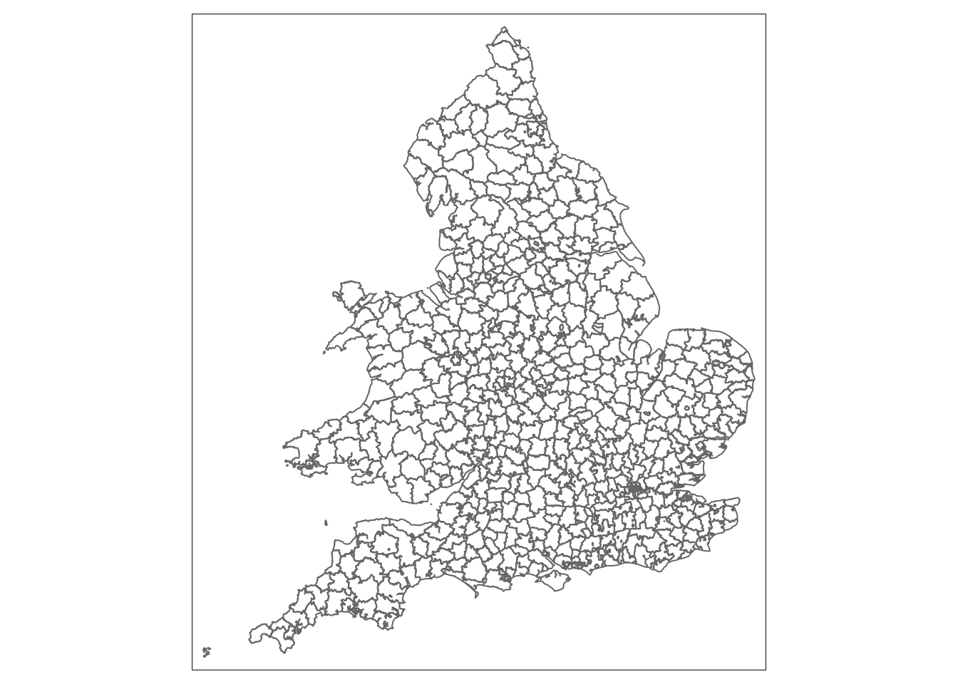
# add another first layer, the fill of the districts instead of their boundaries
#  tip: sometimes _less_ elements and details such as lines on a map, can make presentation _more_ clear.
tm_shape(districts) +
  tm_fill('pct_secondary')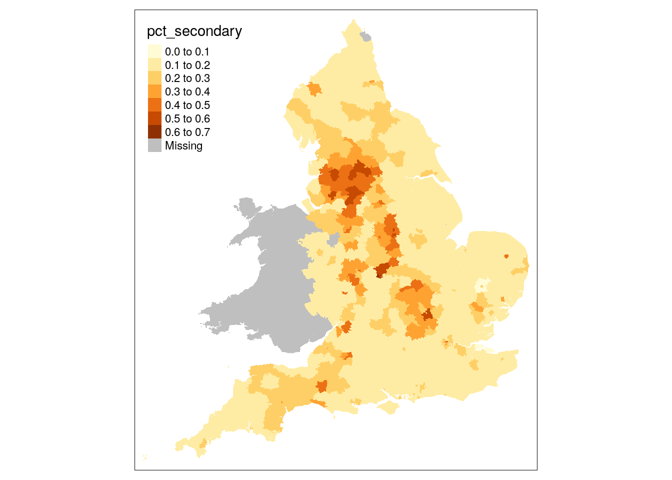
# building in different layers, allows for detailed, seperate styling
tm_shape(districts) +
  tm_borders(col = 'white', lwd = 0.5) + # small white border is less distracting then full black on a map
  tm_fill('pct_secondary', title = 'Emploment secondary sector')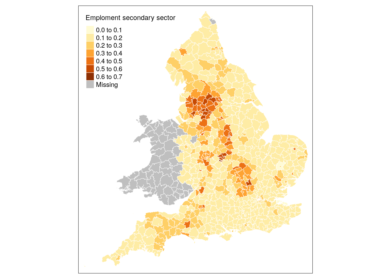
# building in layers allows for stacking different layers with different
#  spatial features, in this case we add another layer with the railways.
tm_shape(districts) +
  tm_borders(col = 'white', lwd = 0.5) +
  tm_fill('pct_secondary', title = 'Emploment secondary sector') +
  tm_shape(raillines) +
  tm_lines(col = 'grey60')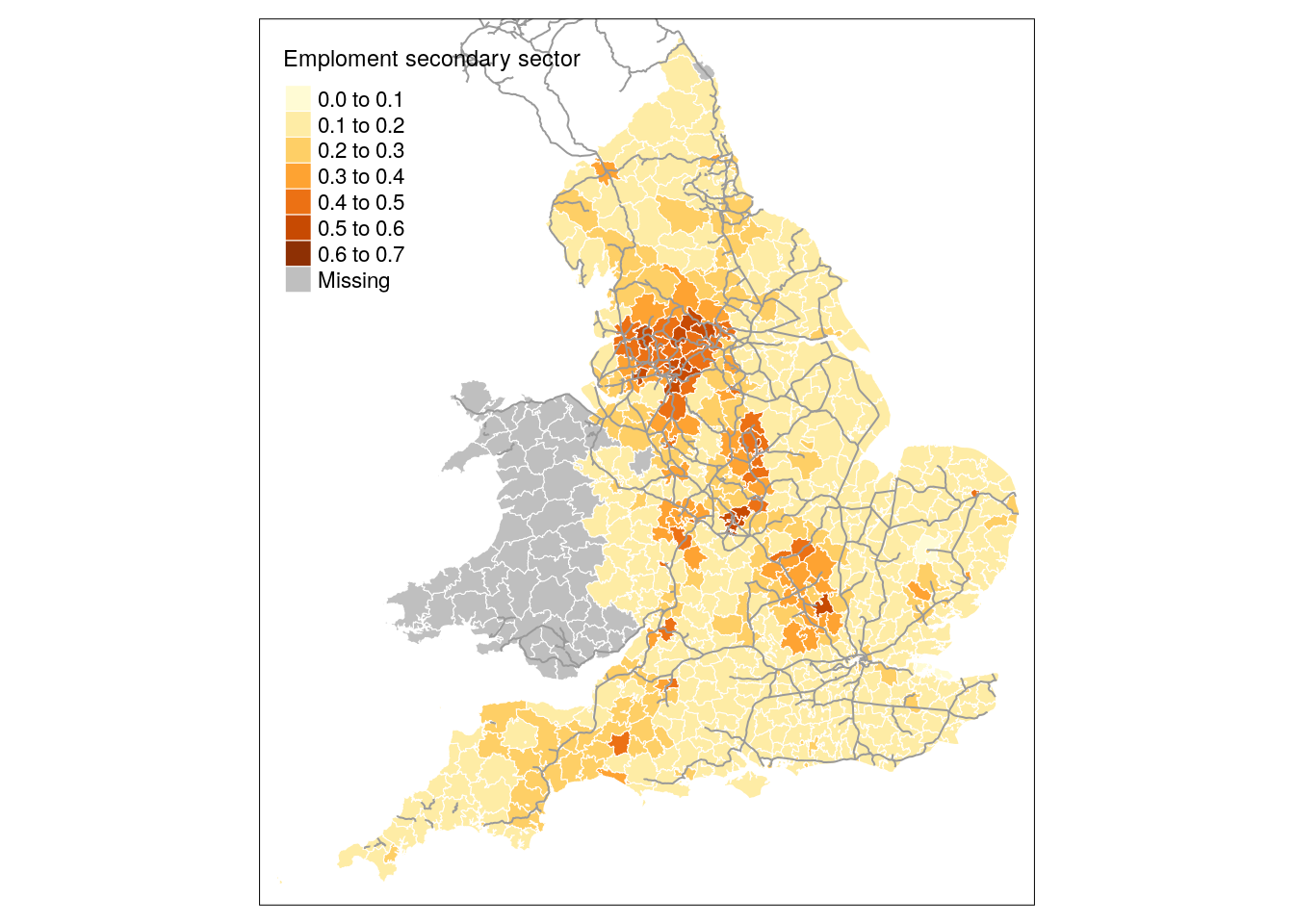
TYhe railway spatial data are not spatial boundaries (polygons) that can be filled, but lines, so we use tm_lines(). Similarly, for e.g. adding sizeble points representing quantities you can use tm_dots() or tm_bubbles()
# subset/filter to the Manchester-area
nwestern <- districts %>%
  filter(R_DIV == 'NORTH WESTERN')

# tm_text() allows to add a layer with labels for the districts
tm_shape(nwestern) +
  tm_fill(col = 'pct_secondary') +
  tm_text('district_name', size = .5)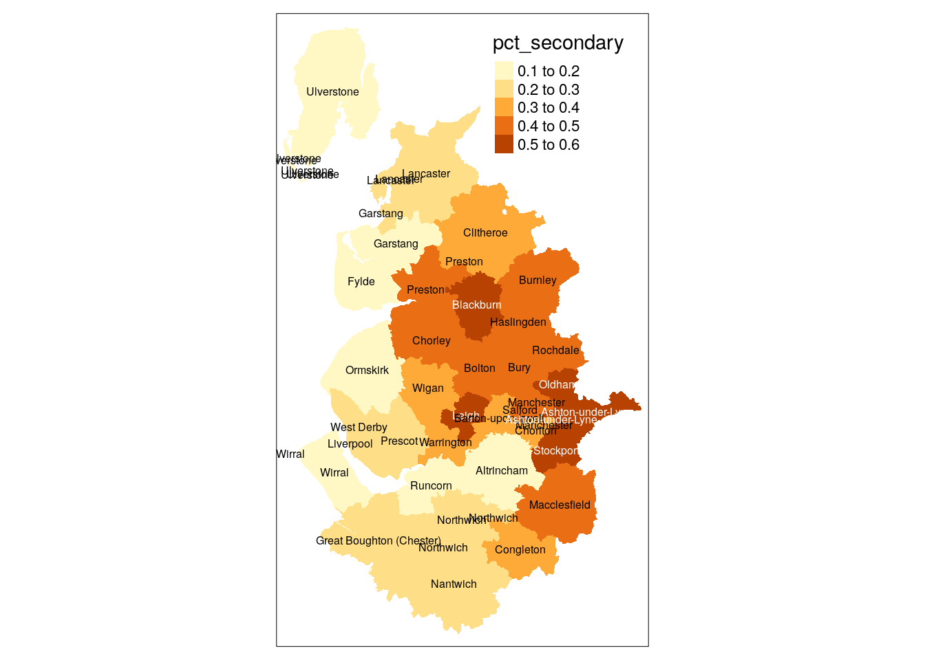
Putting it all together
tmap contains a wealth of other functions (and their options) to futher tweak and style you map. Here we demonistrate addional options for the legend, adding a source below, etc.
map_final <- tm_shape(districts) +
  tm_borders(col = 'white', lwd = 0.5) +
  tm_fill('pct_secondary', title = 'Secondary sector\nemployment', legend.format = percent_format(accuracy = 1), legend.hist = TRUE) +
  tm_shape(raillines) +
  tm_lines(col = 'grey60') +
  tm_layout(main.title = 'Railways & secondary sector employment in 1851', legend.outside = TRUE, frame = FALSE) +
  tm_credits('Source: Cambridge Group for the\nHistory of Population and Social Structure', position = 'right', align = 'right')

map_final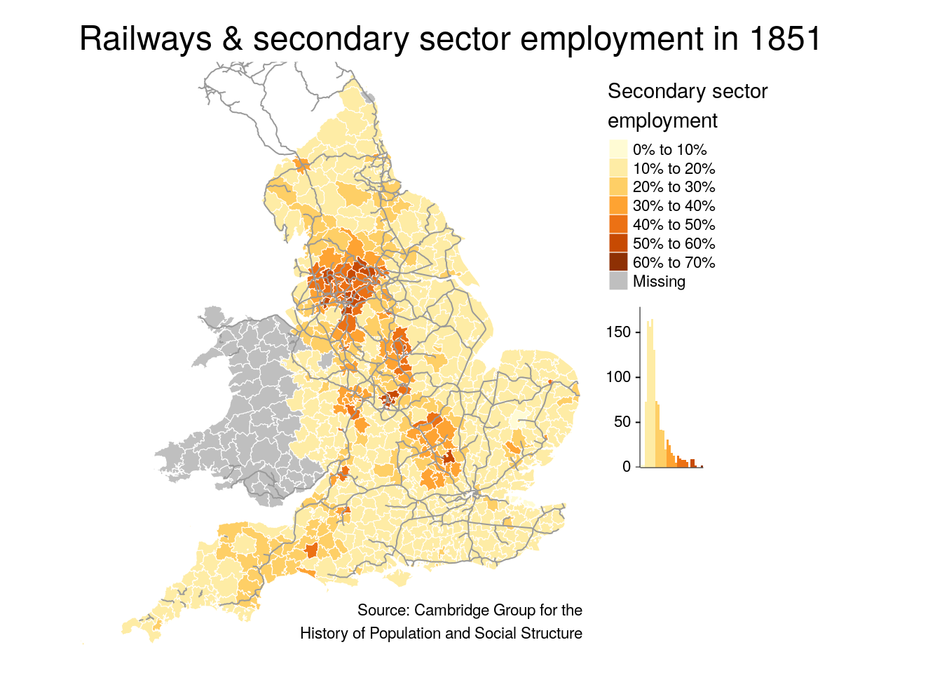
# save final map
tmap_save(map_final, here('output/england_1851_map_final.png'), width = 1920, height = 1920)
## Map saved to /home/rstudio/projects/historical-maps-r/output/england_1851_map_final.png## Resolution: 1920 by 1920 pixels## Size: 6.4 by 6.4 inches (300 dpi)Cherry-on-top: tmap interactive mode
You can switch between static and interactive mode, and re-plot a map to explore interactively. Good for looking at details that might be unclear on the static map, and you need to filter or deal with (eg. smaller inset map ).
tmap_mode("view")
tm_shape(nwestern) +
  tm_fill(col = 'pct_secondary') +
  tm_text('district_name')
tmap_mode("plot")